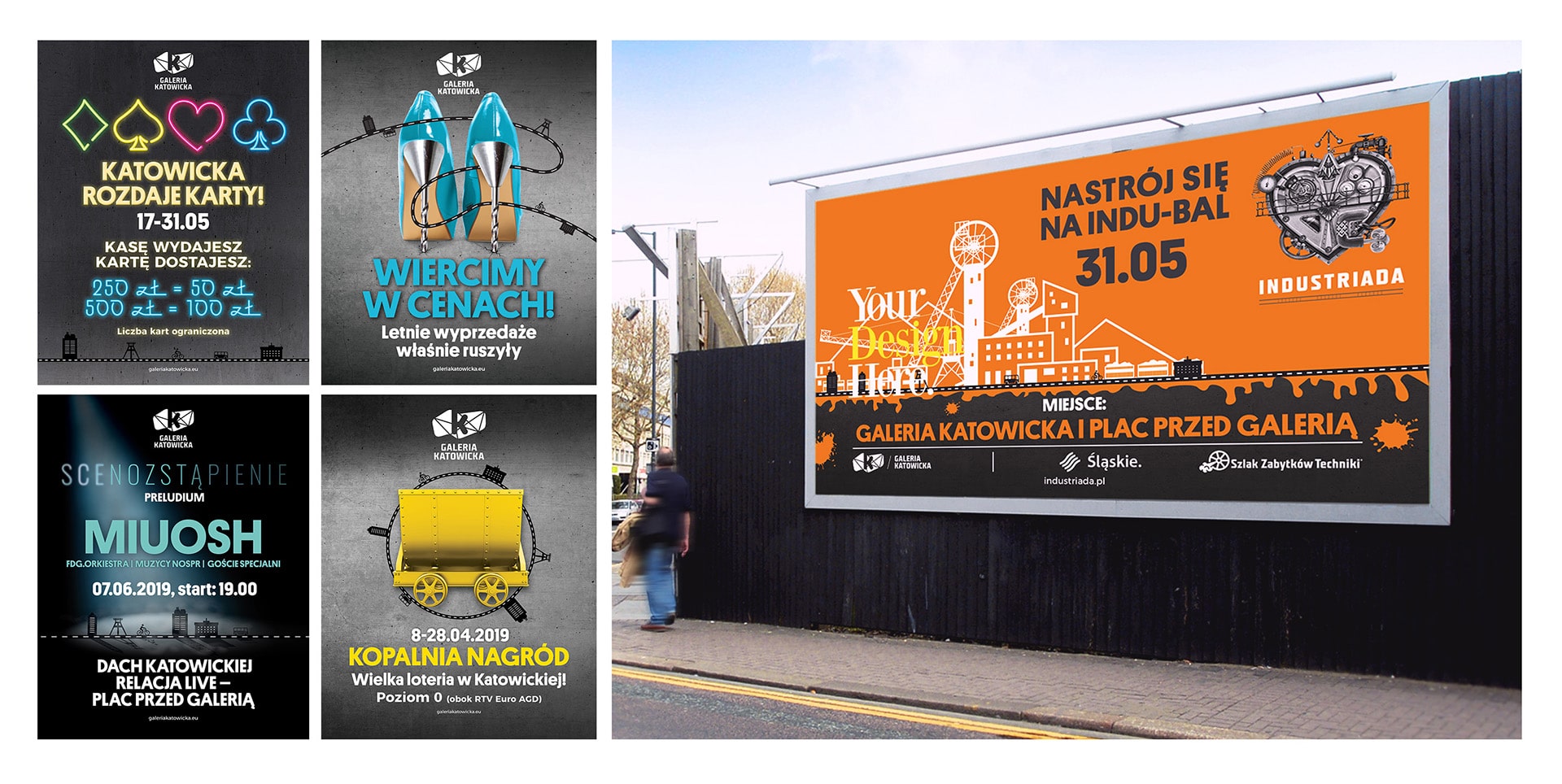
Characteristic Silesian decorative motifs enliven a new and unique visual creative line for Galeria Katowicka.

When asked to design a new creative line for Galeria Katowicka, we knew it had to use symbolic and graphic references to Silesian culture. Valkea designed an innovative and artistic creative line, based on the contextual connection of the city’s traditions and symbols combined with the language of advertising to grab the attention of local residents. We injected that into the Katowice sense of place through characteristic Silesian decorative and architectural motifs.

The communication features a gray background that evokes raw concrete, buildings and urban tissue, referencing Galeria Katowicka’s architectural elements. The background is neutral, does not compete with core graphic elements: it is dynamic, varied with tonal transitions, lined with translucent darker panels, contrasts with the logo, slogan and graphics. In addition, carefully selected photographs keep all visual communication elements legible and create fascinating compositions. Our use of the road theme communicates that Galeria Katowicka is a favorite place for meetings, entertainment and communing with arts and culture. A place familiar to locals, but also brimming with domestic and international tourists, because of its location adjacent to the Katowice railway station.

The campaign, in accordance with our strategy, strongly refers to the modern nature of this shopping center while clearly emphasizing Silesian tradition and culture.